Store Design
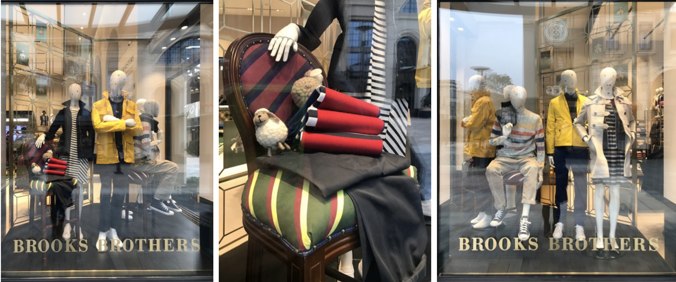
Retail design helps to narrate the brand and product story, educate consumers about the pieces, and – ultimately – make the items displayed more desirable as a result. Design should indeed drive sales. ... The store environment is the ultimate showcase and the physical touch point between the brand and the customer
Brooks Brothers Outlet new store concept
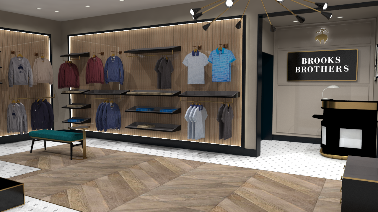
I was given the task to redesign the outlet store fit out concept to make it more up to date, modern, unisex feel that was a level between outlet shopping and full price retail store fit outs. Taking some inspiration from our retail stores, I used the colour palate to deliver tie it back with the new retail concept but not take away from it. Also developed new fixtures that would not only look good but be productive and help highlight out great product.
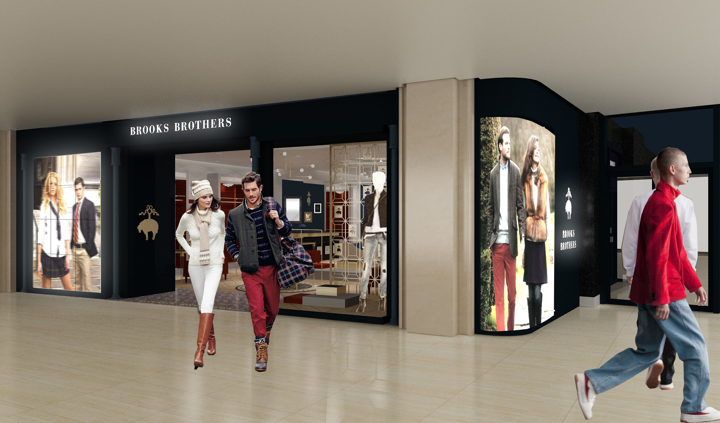
Concept renders
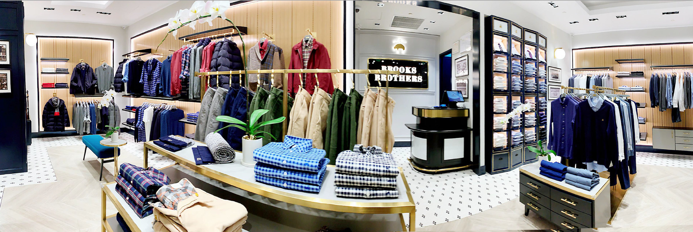
Our first store with this new concept was in Shanghai and a flagship store in a new outlet mall.
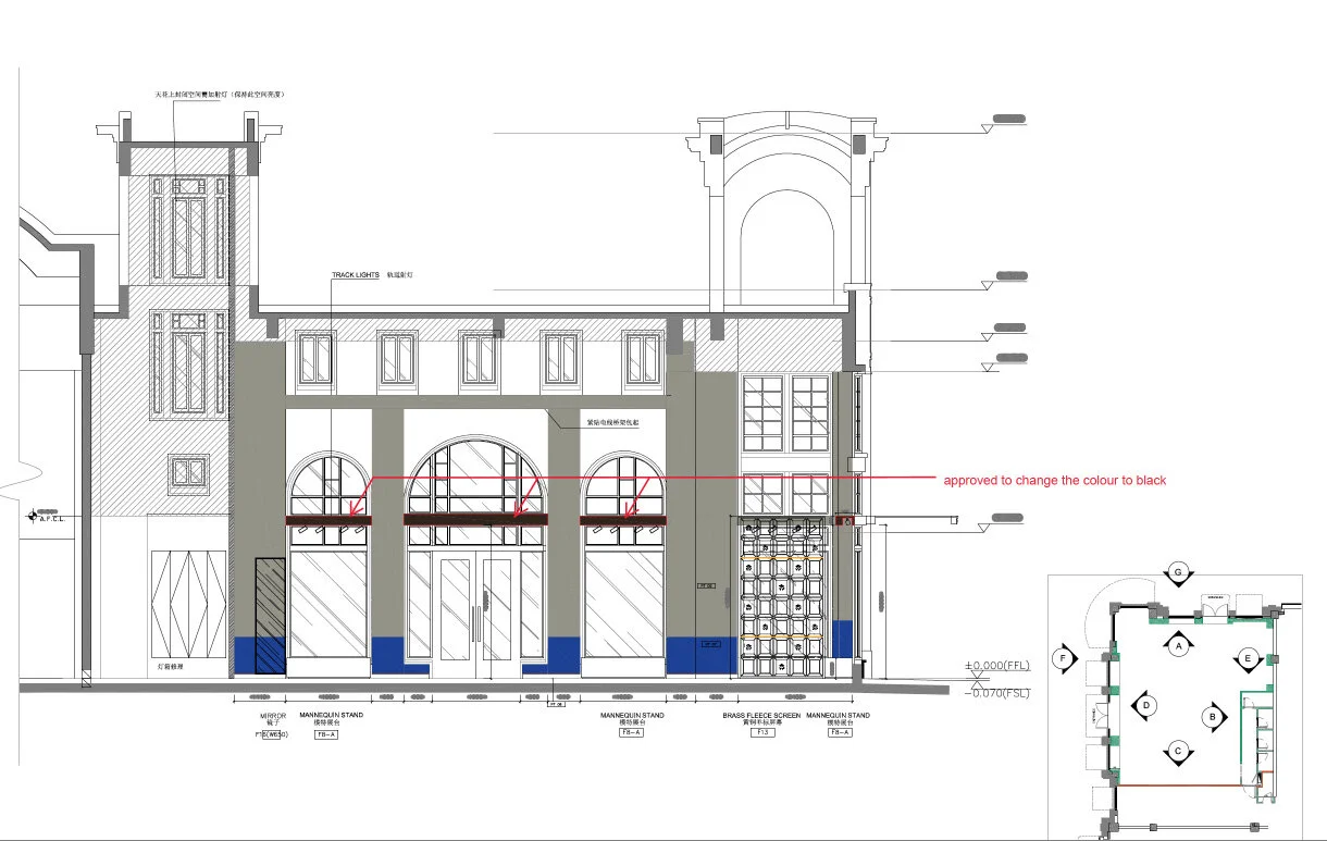
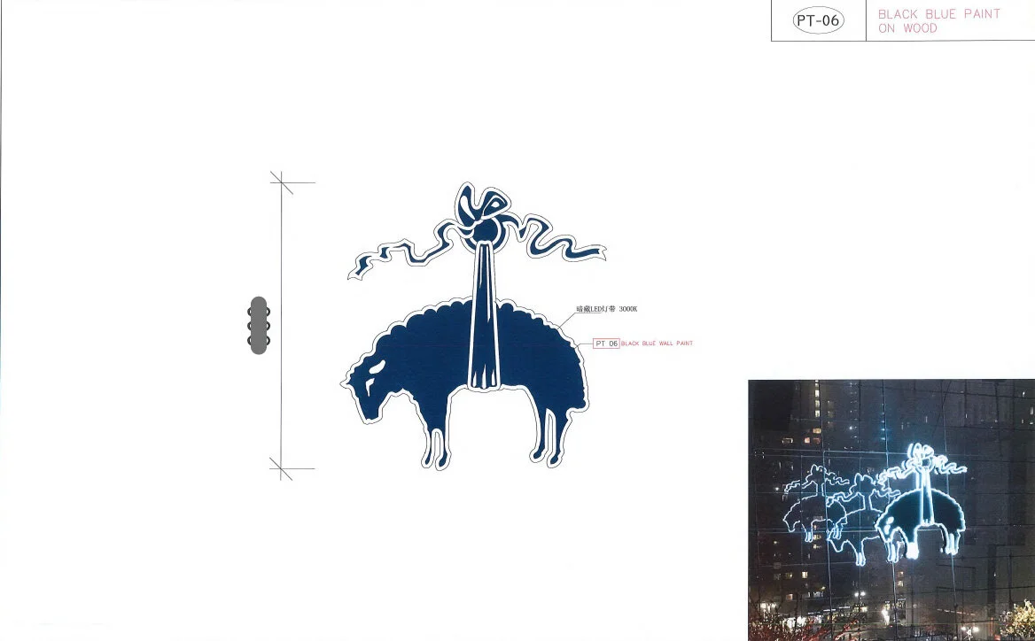
Concept drawings
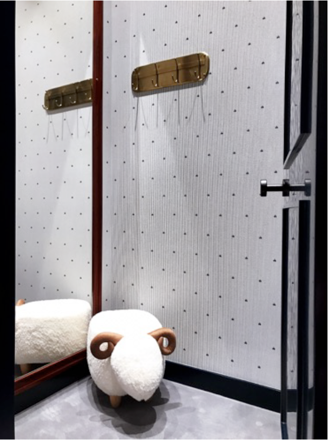
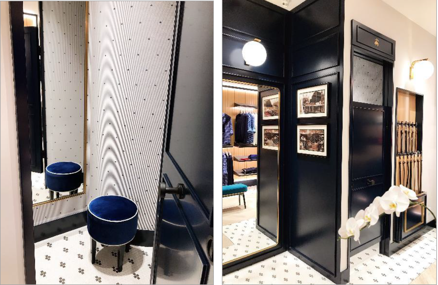
A key feature was the wallpaper on the most visual walls. I created a collage of photos taken from our New York Madison Ave store shop front detailing that has been our iconic flagship store since 1915.
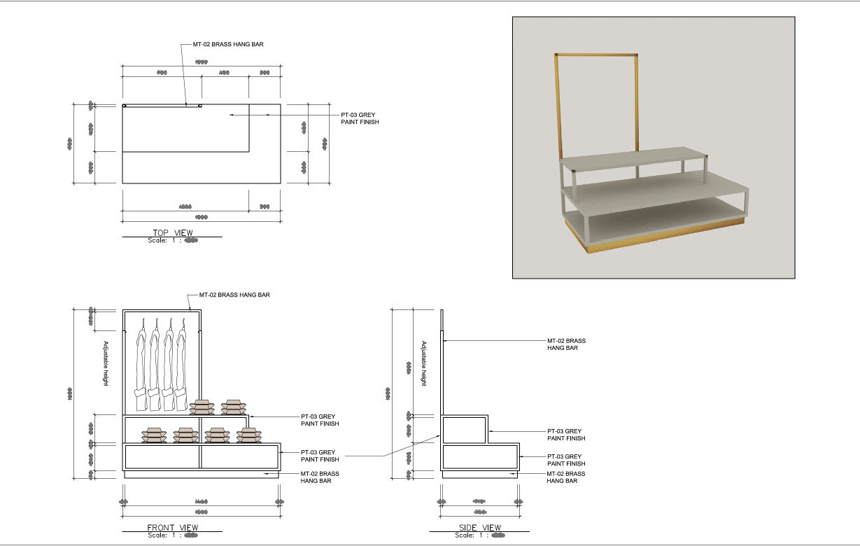
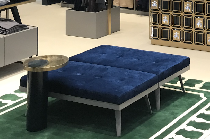
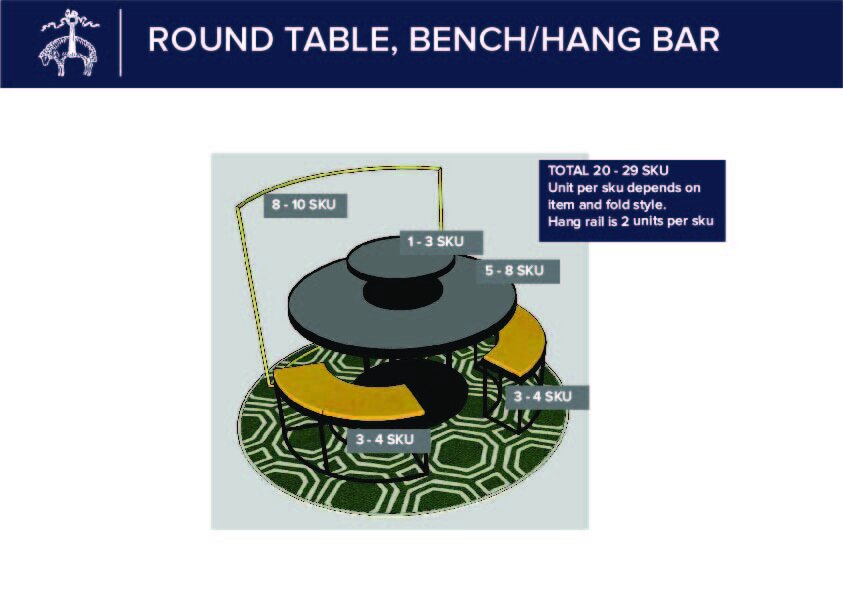
Selection of some of the new furniture I design for the concept
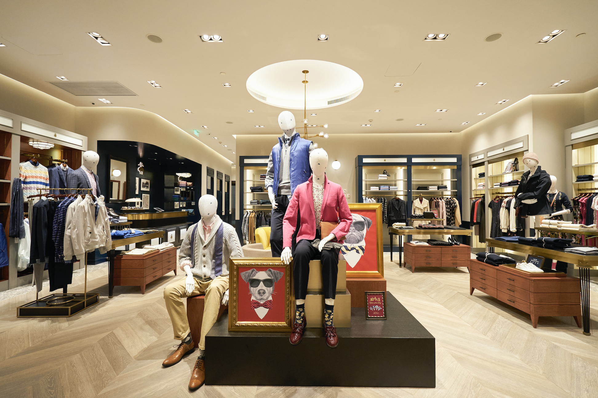
End result
Chino's on display
actual fixture
actual table
wall bay example
They came up super cute and a huge success. We have a grey version also.
finished product
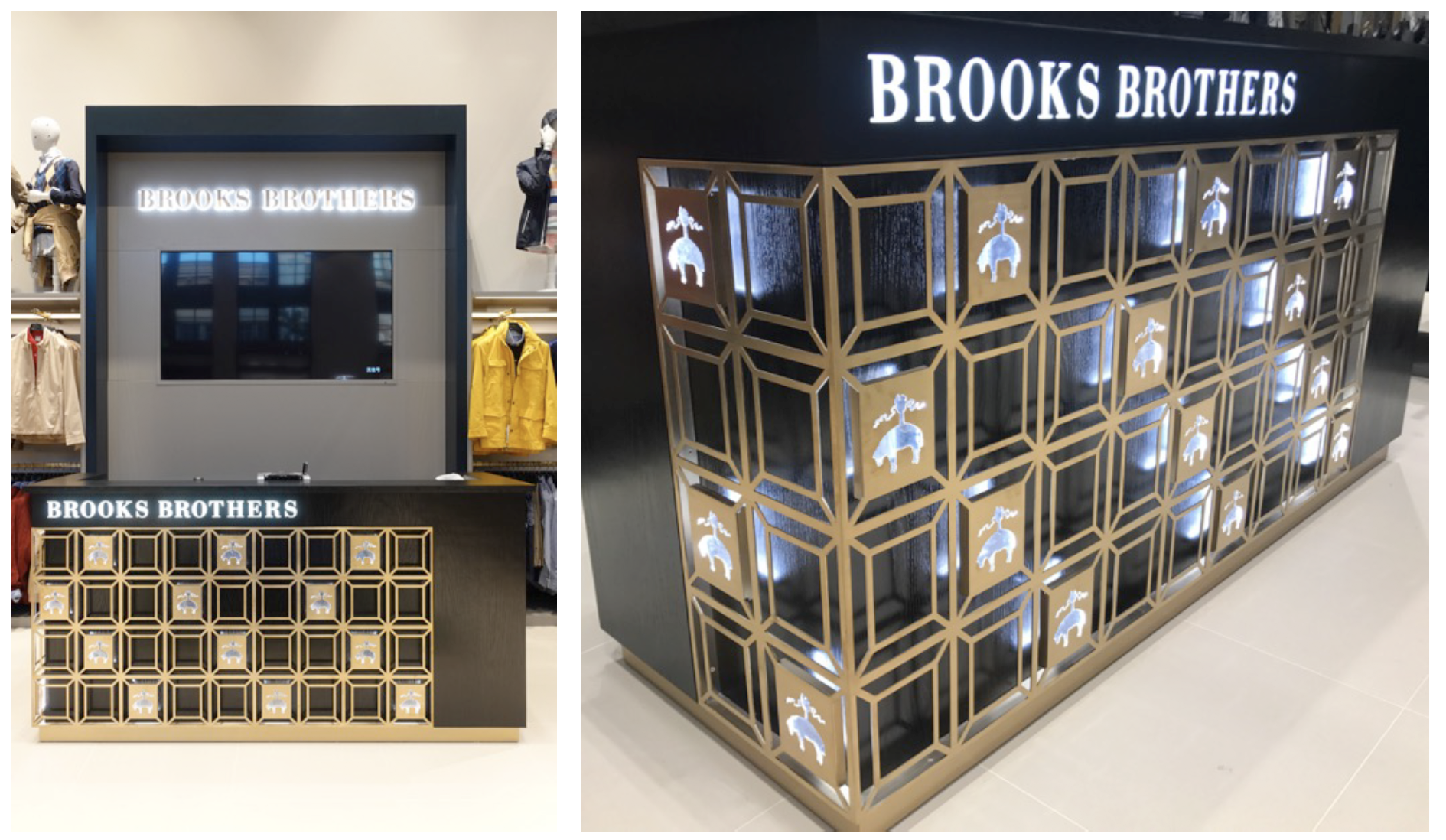
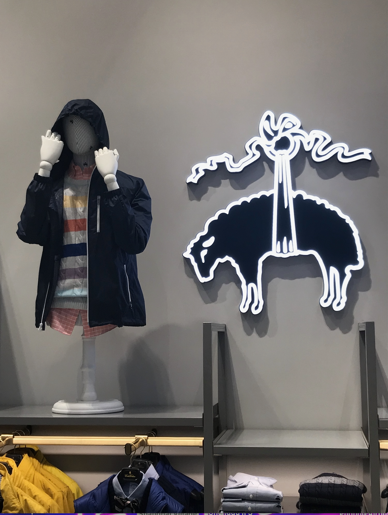
eye catching branding end result
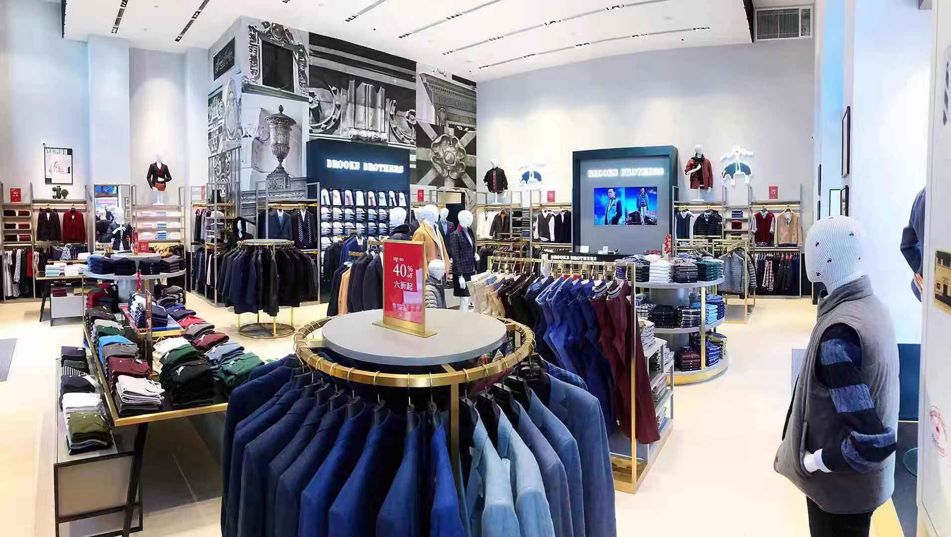
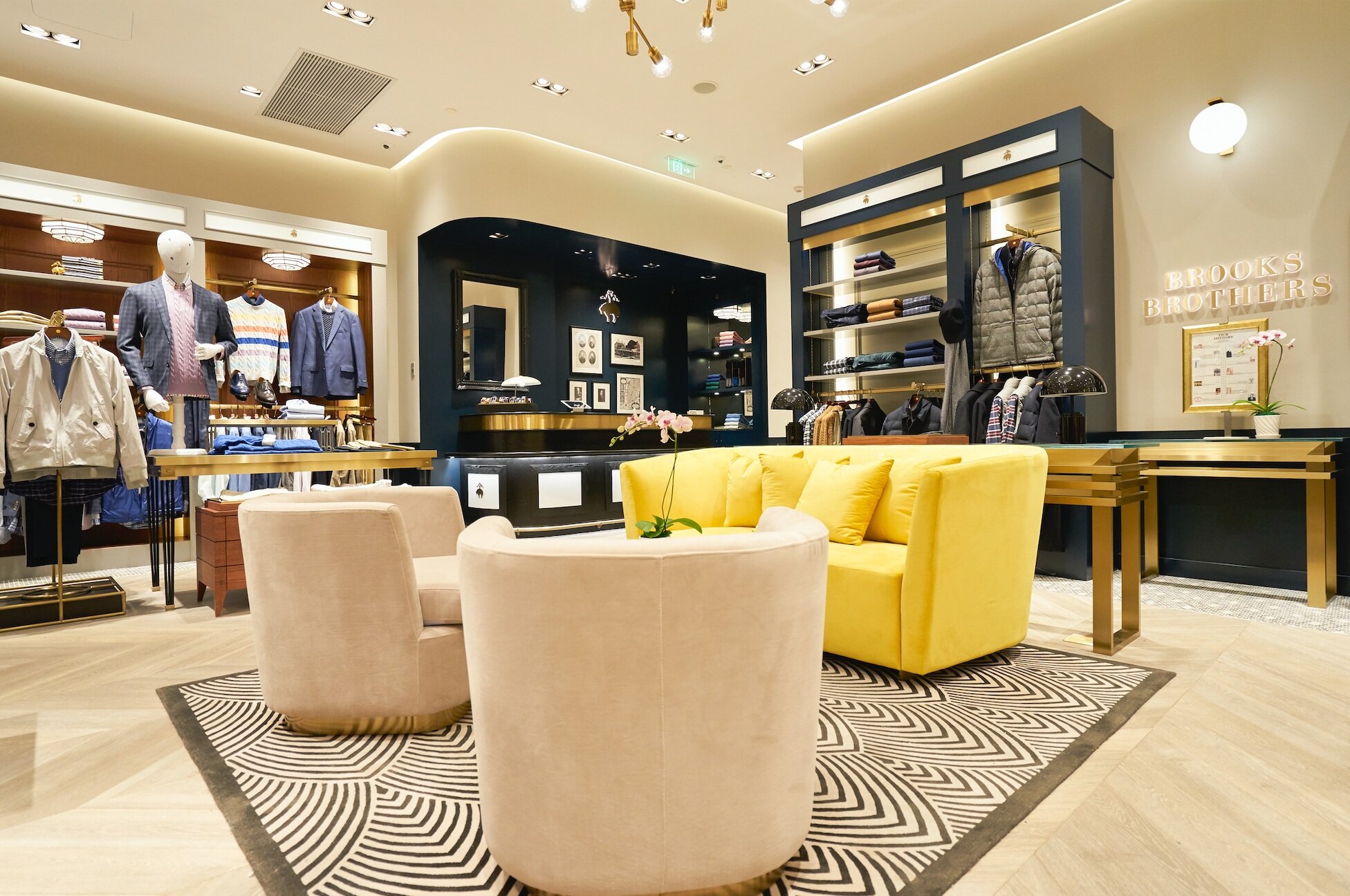
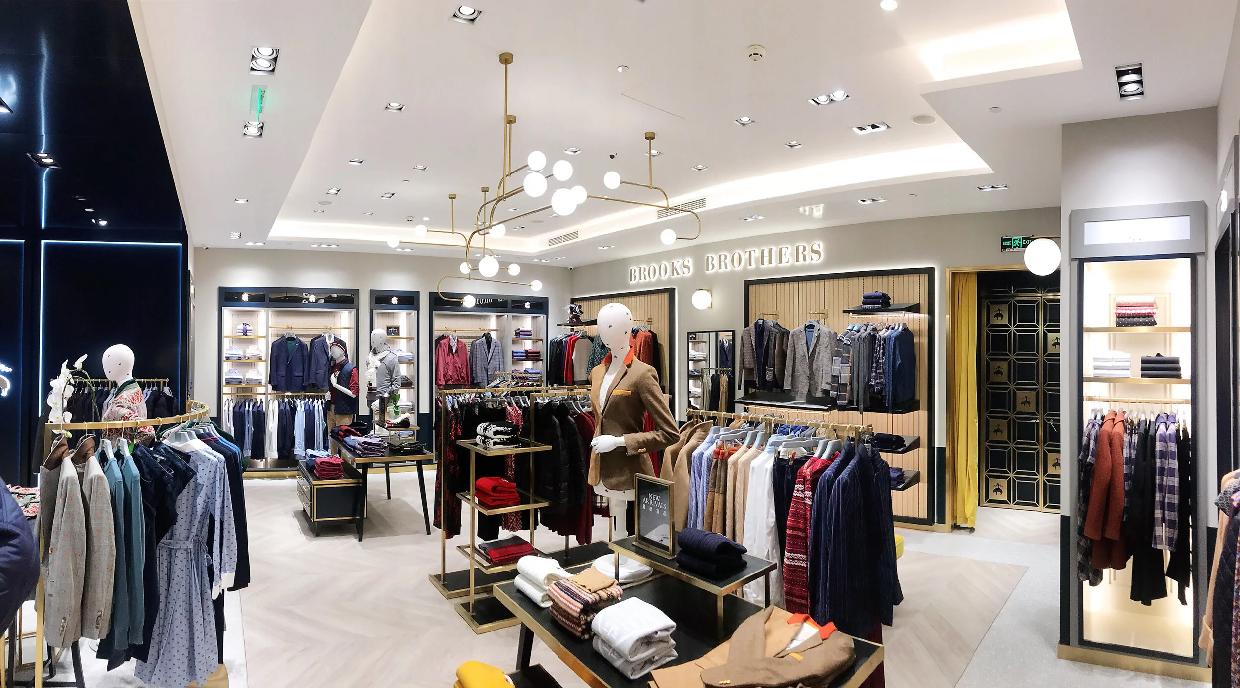
Completed store photos
Brooks Brothers Retail new store concept
The previous Brooks Brothers retail store concept was very masculine with lots of dark wood finishes that played nicely to the brands heritage. For APAC, we wanted to create a more unisex feel to our stores as we grew the women’s side of the business. It was also important to give the design a more modern, light feel without losing our strong history. Working directly with a leading interior design and architectural studio in Hong Kong, we created the new retail concept that later became the global Brooks Brothers concept.
The first store of the new concept in 2017
Renders
Completed store
Concept evolution
Renders
Completed store
Travel retail and SIS concept
Renders
Completed store


